Sunday 9 June 2013

▽ ALIVE IN THE FACE OF DEATH @ WALKER GALLERY


Death is inherently universal - everything that has, does and will exist is not exempted from its fatal grip; and although we are, of course, idiosyncratic beings, incessantly subjected to the likes of cultural stereotypes that detrimentally divide us apart, and media content that adversely illuminates our social and physical differences, death essentially unites us all. The universal relatability of death is arguably what has rendered Rankin’s Alive in the Face of Death, exhibiting as part of LOOK/13 festival, a huge success. As I, myself wandered throughout the exhibition I encountered a preponderance of people who appeared to be responding positively. Many gave considerable time and attention to the works and proved deeply touched by the various stories told by those who have either experienced a close brush with death, live with terminal illness or work within the death industry.

Arguably the most thriving attribute of Rankin’s work is that he allows his sitters to determine how they are portrayed. Each photograph is assigned with a personal touch or enhanced with an element, which denotes the sitter’s personal interests or individual character. Revealing a bit about the sitters’ personalities renders the exhibition less despondent and somber - qualities one would normally expect from an exhibition centered on death. Instead, consequential to the aforementioned feature, the photographs are assigned with a pleasantly surprising degree of optimism, as well as a celebratory feel. Despite the personalised nature of each photograph, Rankin’s signature style is not expelled. Each photograph is consistently embellished with his clean, striking aesthetic; therefore, he has effectively managed to strike a balance between his own presence, through aesthetic and style, with that of his sitters. In spite of the cutting edge, contemporary feel of Rankin’s collection many art historical references are made throughout and this, in effect, helps to dismiss any preconceptions that it is merely style-over-substance - that which many may sadly expect from one renowned for fashion photography. Amongst the serious subject matter of the exhibition and fascinating stories told by Rankin’s sitters, art historical references make it evident that the collection possesses true artistic credibility. Dali and Halsman’s
In Voluptas Mors is distinctively referenced, as well as ‘Vanitas’, a genre of 17th century still-life painting. Similarly, one cannot help but be reminded of Damien Hirst’s famous For the Love of God when they encounter the series of skull mask photographs exhibited in the entrance area.  Such references as these relate particularly well to a gallery like the Walker in which much traditional, historical art resides.

In a curatorial sense, the clean, stark style of Rankin’s work is well complimented by the exhibition space, which clearly adheres to the White Cube aesthetic – it is white, spacious and minimalistic. The white wall gallery system is not only, in a superficial sense, an effective visual facet, it also, on a more profound level, helps to fabricate an environment suitable for deep, philosophical contemplation – that which the stories told by Rankin’s sitters should incessantly inspire in viewers.  Fundamentally, the photographs and stories are vibrant enough on their own; therefore, the exhibition space is appropriately understated. The story telling aspect of the exhibition is feasibly what makes it so engaging. The stories, which are told through extended captions, essentially animate the photographs and become integral to the viewer’s experience. I was particularly blown away by Andrew Douglas’ account. In October 2001, at the tender age of twenty-one, Douglas was stabbed twice and left to die in his friend’s home. Subsequent to undergoing eight-hour surgery and technically dying four times, Douglas’ labours to stay alive paid off. Whilst one would expect to be reminded of the fragility of life from an exhibition such as this, on the contrary, it is stories like Douglas’ that providentially evoke viewers to realise their inner power and resilience, as well as the body’s inherent instinct to survive, as opposed to its inevitability to deteriorate.

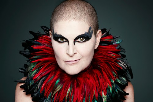
I left the Walker with what was, for me, the most striking image that I had encountered in the exhibition vividly etched into my mind. This was the beautiful photograph of Sandra Barber, a forty-eight year old mother who was sadly diagnosed with breast cancer eight years ago. Adorned with garish neckwear and striking makeup she displays her ‘inner warrior’, as she is everyday battling her life-threatening condition. She looks utterly striking against the inky background that effectively embodies the constant threat of death looming in the foreground of her life. Her eyes are vivacious and full of fire – they peer from behind, distinct, heavy black makeup like a passionate light of vitality in a deathly void. Although the exhibition detrimentally reminds us of our fragility and inevitable inclination to pass away, Rankin’s sitters display a degree of optimism and enthusiasm for life that is truly inspiring. It is somewhat serendipitous that their experiences have rendered them more appreciative of being alive and have blessed them, if you will, with an inherent gratefulness for every second, minute and hour that they attain here on earth.

Life may be transient, but Rankin’s sitters and their inspiring stories are forever eternalised in this evocative collection of work. 
Alive in the face of death
is a must see, and an unequivocal highlight of the LOOK/13 festival.

Sunday 19 May 2013

▽ LIVERPOOL UNFINISHED @ DROP THE DUMBELLS


Liverpool Unfinished – a title, which immediately struck me with its uncanny veracity, addresses, in my mind, the progressive nature of our city. Our story is far from over; there are still battles to be won, justice to be gained - Justice for the 96. We too remain physically unfinished; a vast array of regeneration projects continue to rebuild the city and render it an incessant construction site. Liverpool is both physically and theoretically unfinished, and unapologetically so, rather like Rob Bremner’s beautiful collection of photographs currently exhibiting at Drop the Dumbells on Slater street. Curated by Wolstenholme Creative Space, Bremner documents residents of 1980’s Merseyside in an engaging array of lurid and saliently nostalgic photographs, which stylistically encapsulate the spirit of the era through the many vibrant characters that stood before his lens. Bremner’s collection, being unfinished, leaves space for the viewer to fill gaps in its narrative with their own imaginations. This facet of the photographs can be deemed idiosyncratic, as photography, clearly being a medium, which provides a hyper realistic portrayal of situations and events, seldom requires the ingenuity of its viewers.

To my surprise, the photographs were projected, as opposed to being hung, a curatorial decision I understand, which was made by the curators and not the artist himself. Allegedly, it was the cinematic quality of the images that made the curators feel this would be an effective means to display the photographs. I completely concur that it was, as the brightly projected images juxtaposed effectively with the dark, empty void that was the exhibition space and this made the images all the more striking and made me feel almost completely encapsulated.  The small, confined nature of the exhibition space also added to further to this sensation. However, it was, notably, the sound of the changing slides, which remains my fondest, and most prevalent memory of the exhibition, as this fabricated a really atmospheric, sensory experience – it made the vitality of the images transcend their two-dimensional format. The only problematic attribute I could make about this curatorial approach was that, being in close proximity to the door, the slideshow would frequently be disturbed as visitors entered and exited.

Although the slide transitions, cast viewers into complete darkness and subsequently fabricate an interval between each image, Bremner’s work is so stylistically consistent that the images do not feel at all disjointed, or divorced from one another. Lurid colours and seemingly staged compositions are frequently uninterrupted attributes that denote a sense of uniformity.  Furthermore, the gaze of Bremner’s subjects is almost always returned and this engaging degree of attentiveness from the subjects draws one into the photographs, producing a feeling of intimacy and a heightened sense of presence. Although the preponderance of the images feel quite staged and orderly they do not feel contrived, they still simultaneously maintain an air of naturalness and spontaneity that almost makes them seem voyeuristic. I regard this incomprehensible balance that Bremner has achieved between order and spontaneity, as the primary reason that the collection is so successful, even in its allegedly unfinished state. The sense of order that one gets from some of the compositions is also well juxtaposed with the bright colours that create a sense of drama and disarray.   The colours also appear responsible for their cinematic feel that is obviously exaggerated by the choice of display.

Two young girls, clad in bright, garish fashions stand in front of graffiti adorned backdrop, whilst a trio of boys loiter around their lustre, red car. It was images like this, I felt, in which groups of youths are captured, that proved the most engaging. This is consequential to the fact that I felt the younger subjects effectively embodied the zeitgeist of the era more having them clearly embraced current trends more conspicuously, with their quintessentially 80’s fashions and haircuts, and their tendency to be caught in front of more edgy, urban settings. Generally speaking, images of youth, for me, feel much more nostalgic, as they encapsulate when one is most full of vitality and enthusiasm; Bremner’s photographs truly exemplify this proclivity I feel.

An evocative title and a truly accomplished collection of photographs, rendered even more effective through their interesting curatorial display - it certainly seems that Liverpool’s best DIY art space is back and just as our city and Bremner’s wonderful collection, its chronicles are clearly far from fruition. Rendering Bremner’s exhibition as a brilliant starting point, it commences its journey as a creative producer, working on a mobile basis, producing exhibitions and events across the city that I myself am sincerely looking forward to.


Tuesday 26 March 2013

▽ THE ART OF POP VIDEO @ FACT


FACT’s highly anticipated, The Art of Pop Video,  professes itself as the UK’s first exhibition to discuss the popular music video as a site of credible artistic intervention. I, however, had found myself undeterred from questioning the exhibition’s acclaimed originality. Its conspicuous centralisation on popular culture made it appear, in my mind, a meagre sequel to Tate’s recent exhibition - Glam!; and although I deemed Glam! highly successful, the local art scene’s current predisposition towards popular culture has rendered me somewhat skeptical. As cynical as it sounds I feel as though institutions are adopting pop-orientated themes merely in a pursuit of widening their audiences, as opposed to revolutionising or ameliorating the local art scene in anyway. Nevertheless, in spite of my skepticism with regards to FACT’s intentions, I attended the exhibition completely open minded and vowed to reserve any degree of prejudice I possessed.

Upon entering the exhibition space I was instantly struck by one indisputable certainty - the television monitor had boldly replaced the canvas. This, I believed, was truly illuminating, as it embodied the fact that throughout history new media and various technologies have conspicuously altered art and the way in which we view it. Nevertheless, the idea of substituting the canvas was by no means a ground-breaking concept, as this year’s John Moore’s painting prize, for example, revealed a number of exhibiting artists who embraced this conspicuously; the best example having been, in my opinion, Laura Keeble’s I’d Like to Teach the World to Sing, in which a compressed Cola can acted as the canvas.  Furthermore, endorsing in the television monitor as the medium through which art was experienced, clearly has its disadvantages and the broken monitor in the first gallery space, which I happened to discover, sadly exemplified this. The multitude of television monitors and projected videos also fabricated a visually and aurally overwhelming space, which some viewers may, as I did at times, find quite distractible. However, at the same time, this sensory overload in which the viewer is very much liable to succumbing to, conversely fabricates a very lively and accessible space that is without esotericism. The exhibition fundamentally consists of two gallery spaces, which are located on two different floors of the institution and I was somewhat irked to ascertain that both exhibit exactly the same thing – numerous television monitors and projections. Whilst I could accept one space consisting of videos, two I thought, was pointless, lacklustre and repetitive. Even though the exhibition is, of course, centered on pop videos, and it therefore makes sense to have a multitude of videos to watch, I believe the exhibition would have proved more successful if just one space consisted of videos and the other of perhaps visual art that discussed the intrinsic relationship between art and music videography.  Nevertheless, this did by no means lessen my appreciation of how videos were categorised into unanimously concurring themes. This successful curatorial feature evokes viewers to decipher links between the videos, and therefore laudably influences them to perceive them as possessing artistic value as opposed to being frivolous, kitsch and quintessentially pop. I particularly enjoyed the videos, which had been brought together under the theme of ‘abstraction’; deciphering such a seemingly obscure theme amongst pop videography was certainly thought-provoking and commendable.  

Interestingly, only one set of headphones is allocated to each television monitor throughout both exhibition spaces, and this notably endorses a more intimate viewing experience. In a visual sense of course, multiple viewers can still experience each video simultaneously but due to the headphones, viewers only fully experience each video consecutively.  Thus, the viewing experience becomes much more personalised to the viewer.  One acknowledges that they are, in the moment of experiencing each video, along with the allocated headphones, the only viewer who is acquiring the full experience and is properly immersed. This in due course, helps to fabricate a viewing experience evidently more personalised than if one was stood in front of a piece in which multiple viewers could fully interact simultaneously. For me personally, a notable degree of interest was evoked from how the generality of other viewers displayed an excellent level of attentiveness to the exhibited videos.  My incredulity towards the public’s commendable degree of attentiveness to the exhibition’s content, is merely consequential to the fact that people seldom bother to spend long amounts of time observing or focusing on one particular work of art. Furthermore, video installations very rarely get the attention and time they require.  Thus, when questioning why the viewing dynamics of this exhibition proved considerably different I came to the conclusion that it may be due to the musical element it possesses. Pop music is instantly satisfying and I think the instant appeal of it is what made the viewers more inclined to give time to each video. Certainly, if the videos had been without their pop music audio, and instead, just moving images, I doubt that people’s attention spans would have lasted as long. 

On the whole, my initial skepticism with regards to FACT’s intentions through endorsing in popular culture was slightly lessened by how the exhibition succinctly explored the impact that fine art has had on popular music videos. With New Order’s Blue Monday video, fascinatingly compared to a “Dadaesque series of images” I felt much more convinced that the exhibition was for arts sake, as opposed to purposefully increasing the institution’s audience.

Wednesday 20 February 2013

▽ THE UNIVERSAL ADDRESSABILITY OF DUMB THINGS @ THE BLUECOAT


It has recently occurred to me that the unconventional and the bizarre are in fact common interests of Liverpool’s current wealth of exhibitions. Whilst Glam! The performance of Style at Tate,  focuses on the garish pop culture of the seventies,  Mark Leckey’s The Universal Addressability of Dumb Things at the Bluecoat, boldly celebrates the absurd and the whimsical. The past few weeks have brought about a notable amount of unorthodox art happenings  - everything from an large, projection of Mark Bolan’s face in the Albert Dock, to an enormous, inflatable cat arriving at the Bluecoat. Likewise, it is also worth mentioning the lurid dress made entirely of hair that has recently appeared in the Walker.  I have somewhat endorsed in this apparent trend of jovial, light-hearted art currently taking over the local art scene and I find it rather refreshing if anything, as one must admit, we can at times take art too seriously, intellectualising it too much, or trying to advocate political or social change through it. Sadly, this can often take the fun out of art and make it significantly less accessible. On that note, I must say that I attended Leckey’s exhibition with great enthusiasm. 


The Universal Addressability of Dumb Things, curated by Turner prize-winning artist Mark Leckey, explores how our relationship with artworks and commonplace objects is being transformed by the augmenting rise of new technologies.

Upon initially encountering the exhibition, if anything, I felt it recalled aspects of Dadaism, and this sadly made me question its originality. Usually, I would not be bothered by seeing something that had clearly been done before, but I as I felt the exhibition was in some ways trying to pose as new and different it bothered me slightly. The exhibition’s clear rejection of reason and logic, but clear embracing of absurdity adhered closely to Dadaist ideologies.  Although I admit the fundamental concept of the exhibition was rather unique and thought provoking, the notions, which were evoked by the artworks and the displays, were seemingly unoriginal. As the exhibition was built on a concept that was apparently unique I felt it had made a promise to its viewers to give them something a bit more original than a revival of Dadaism. 

Dwight Mackintosh’s Untitled was one of my favourite pieces of the exhibition.  This was consequential to the fact that it reminded me a lot of Jean Michel Basquiat of whom I happen to be a big fan of. Its raw, expressionistic style and primitive looking figure made me immediately think of Basquiat. Apparently, Mackintosh’s drawings can be recognised by their ‘x-ray’ views of the human body, and this is really evocative to consider, when one acknowledges the fact that Basquiat was also inclined towards this in his own work, as he was a noted enthusiast of the classic anatomical study Gray’s Anatomy.  The title of this piece also struck me as an uncanny reference to Basquiat, as a great wealth of his work was ‘untitled’. Furthermore, when I had ascertained that Mackintosh had spent fifty-five years in mental institutions the piece seemed to develop more layers to it; the expressive, flowing lines seemed to now have more meaning and emotion underneath them. It certainly is a coincidence that Basquiat was also a tortured soul and he created work of a similar style to Mackintosh. A few steps away from Dwight’s piece was Transmission of a Blinderator by Joey the Mechanical Boy. Its close proximity to Dwight’s piece was really thought-provoking, as the artist of this painting was actually an autistic child who believed that he could only function as a machine. It seemed an excellent piece of curation had been implemented, as both artists had a mental illness or disorder. Similarly, Dwight apparently had a fascination with machinery,  and there was evidence of this in Untitled; therefore, fascination with machinery was yet another evident parallel.


There were lots of machine imagery pieces placed around this area of the exhibition and most, if not all the artists were male. It was therefore as though gender was being discussed on an underlying level. Machines are thought of as stereotypically masculine objects, but our common inclination to denote these sort of objects as intrinsically male is a mere societal construction. It is as though the curation of the two aforementioned pieces was trying to adhere to common societal beliefs regarding gender, and I did not enjoy this. Even though I had appreciated the other links that had been made between the two aforementioned artists’ I did not enjoy the formation of cliché male imagery. 


Gender discourse through the means of curation seemed to continue in the nearby space, where images of the female body were displayed in close proximity to one another. John Tenniel’s Pygmalion and the statue, a piece, which denotes the pure ideal of Victorian womanhood was placed right next to Leon Harmon and Ken Knowlton’s, Studies in Perception, yet another image of the female nude. A startling contrast between how women were represented in the exhibitionand how the male identity was defined unsettled me. Women had been represented by nude figures, merely as objects of the male gaze, were as machines – objects that epitomise modernity and productivity, represented men. Even though I thought it was just as demeaning for masculine stereotypes to be played up to, it was the contrast between the male and female imagery that bothered me the most, as it was extremely stereotypical. If new technologies have in fact transformed our relationship with art and objects, like this exhibition claims, then why does it recall stereotypical images of both genders through art and objects that have existed long before the arrival of technology? Personally, I feel it seems something of a contradiction.

Before attending the exhibition I had not expected to leave thinking about gender representation. It seemed to me, that despite the vast amount of unserious pieces of art on display, the curation still managed to put me in a serious and critical mood. Nevertheless, this certainly did not deter me from enjoying other aspects of the exhibition, as there was without doubt a great deal of interesting pieces on display that were refreshing in all of their light-heartedness and occasionally humorous nature.